Choosing the right graph type
Paper 2 often asks candidates to choose, name or justify a graph type, so matching the data to the right graph is itself examined. A bar chart compares separate categories; a line graph shows a trend over time; a pie chart or divided bar graph shows proportions of a total (summing to 100%); a scatter graph shows the relationship between TWO variables; a population pyramid shows age-sex structure; and a triangular graph plots THREE percentages summing to 100% on angled axes.
Mean, median, mode and range
The syllabus requires four statistical measures, each answering a different question. Mean = sum of values / number of values. Median = the MIDDLE value once ordered (even count: the mean of the two middle values). Mode = the value occurring most often. Range = highest minus lowest, measuring SPREAD, not a typical value. The mean is pulled towards extreme values but the median is not, so the median is often more representative when a set contains an anomaly.
Describing a graph: pattern, figures, anomaly
A full "describe the graph/trend" answer has three ingredients. (1) The overall pattern -- rising, falling or fluctuating -- in comparative words (higher/lower). (2) Specific figures WITH units at named points ("rose from 180 thousand in 2016 to 225 in 2019") -- statistics alone are not a description. (3) Any anomaly, described and quantified separately ("but in 2020 it fell to 60 thousand"). Folding the anomaly into "it fluctuated" loses marks.
Drawn from real examiner reports.
Read triangular graphs along the angled axis
A triangular graph has three axes at an angle, not one vertical axis. Each percentage is read by following the guideline PARALLEL to the correct side from its variable's axis. Reading straight up and down, like a bar chart, gives a wrong figure -- examiners note 25% read where the angled value was 15%. Trace the parallel guideline for each axis before reading off.
(s23 P21 Q2a)
Name a workable graph type precisely
Naming or justifying a graph type tests the "choose the right graph" skill, and is answered poorly. For age-sex data, candidates often suggest a line or scatter graph -- which cannot show two variables either side of a central axis -- not a population pyramid. A second trap is vagueness: "pyramid" alone is not accepted for "population pyramid".
(w23 P23 Q2a)
Quote exact figures, not vague words
When reading a graph or table, precision is credited and vagueness is not. Saying a value is "about 200", or "the majority" when the exact figure can be read, forfeits marks an exact figure would earn. This matters most in "majority" claims about a value under 50%. Always quote the precise number with its unit (people per km2, %, mm, thousand).
(s23 P21 general comments)
Describe what the graph shows, not why
When a question asks what a graph or resource SHOWS, describe the data -- its shape, values and pattern -- not its causes. Asked to read a population pyramid or trend, candidates often explain WHY (birth/death rates, migration) instead of stating what the resource displays. Save causes for an "explain" question; a "describe" mark is earned only by reporting the shown data.
(w22 P12 Q1b(i))
Range measures spread, not average
The range is not a type of average. It is the highest value minus the lowest, and measures how SPREAD OUT the data is -- the gap between extremes -- not a typical or central value. Candidates sometimes quote the range where a mean or median is wanted, or confuse it with the median (the middle value). Keep them separate: range = spread; mean or median = the typical value.
Name the anomaly, do not bury it
An anomaly is a value that clearly breaks the pattern, and must be named and quantified SEPARATELY from the general trend. Candidates often absorb it into a vague "the figures fluctuated", losing the mark. State the overall pattern first, then flag the anomaly explicitly -- the exact year and figure -- e.g. "numbers rose steadily, but in 2020 fell to 60 thousand".
The mean is not always the best average
A testable wrong belief: that the mean is always the fairest "typical" average. The mean uses every value, so a single anomaly pulls it away from the typical value. The median takes the middle value once ordered, so an extreme barely affects it, making it more representative when an anomaly is present. Use the mean for evenly-spread data, the median when an anomaly exists.
(general exam skill)
Describe a trend in three steps
For a graph or table description: open with the overall pattern in comparative language ("a rising trend"), naming the start and end values; support it with a specific figure and unit at a named point; then name and quantify any anomaly separately, not "it fluctuated".
Compare means link the two data sets
A "compare" answer must LINK the two data sets, not describe them one after the other. Quoting each set's figures side by side is not a comparison. Use explicit comparative words -- higher/lower, greater/smaller -- e.g. "one mean, 90 mm, is higher than the other, 65 mm".
Match the graph to the variables
Match the data to the graph type before drawing: separate categories give a bar chart; a value over time a line graph; parts of a total a pie or divided bar; two related variables a scatter graph; three percentages a triangular graph; age-sex a population pyramid.
Show the formula and the unit
Calculation marks need working and units, not just a number. Write the formula (e.g. percentage = part/whole x 100), then give the answer with its unit (%, people per km2). A value with no unit is incomplete, and the working earns method marks even if the figure slips.
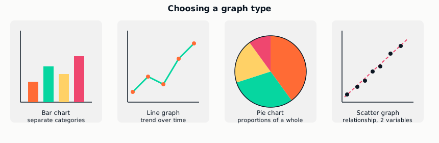
Match the number and type of variables in the data to the graph type -- this is itself an examined skill.
| Graph type | Best for |
|---|
Full notes, flashcards, Q&A and the topic quiz for every premium subject.
Premium plans are US$8.99/month or US$49.99/year — first month free.
Studying with a parent's blessing? Show them this.
